

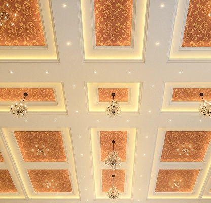
The color palette for a room can be one of the most significant and challenging aspects of decorating a space. Colors have the power to transform moods and functionality. The color scheme in the transformation can make a difference in bedroom interior design, kids room interior design, and dining room design.
Choosing the right color palette doesn't have to be too expensive. With the right approach and guidance, you can transform your space with the best interior decorators. In this blog, we will explore the color selection process, the psychology of color, and materials to create a balanced and beautiful room.
Before selecting the color section for interior designs, it's important to understand the basics of color theory. It will help to understand the difference in colors that impact space.
Primary, Secondary, and Tertiary Colors are the basic colors used in home and Commercial interiors in Bangalore.
Primary Colors : Red, yellow, and blue are the primary of all other colors.
Secondary Colors : Green, orange, and purple
Tertiary Colors : These colors are formed by mixing a primary with a secondary color.
These relationships of colors can help you make informed decisions when pairing colors in your space.
The Color Wheel and Color Harmony
The color wheel is a helpful tool for Home and Commercial interiors in Bangalore. Adjacent colors in the color wheel are known as analogous used in the interiors and they create harmonious combinations.
Analogous Colors : Blue, blue-green, and green, are known as analogous colors in the color wheel. They create a serene and cohesive feel in the Home and Commercial interiors of Bangalore.
Complementary Colors : Blue and orange or yellow and purple, are complementary colors. They create vibrant and energetic contrasts in the Home and Commercial interiors of Bangalore.
Triadic Colors : Red, yellow, and blue are triadic colors.
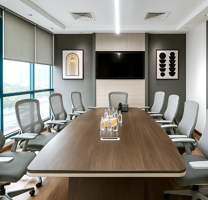
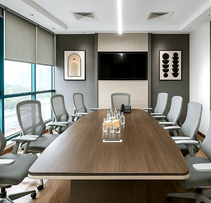
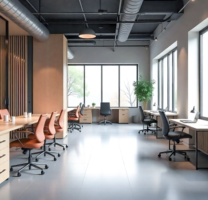
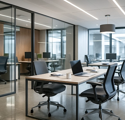
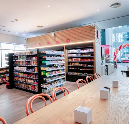
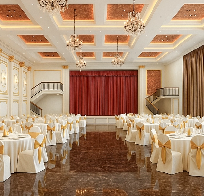
The purpose of the room design of the commercial interiors in Bangalore should play a major role in your color selection. The mood and the atmosphere can be affected by the selection of colors. It gives a feeling of calm, energizing, or even romantic in the choice of colors. Choose the color scheme accordingly:
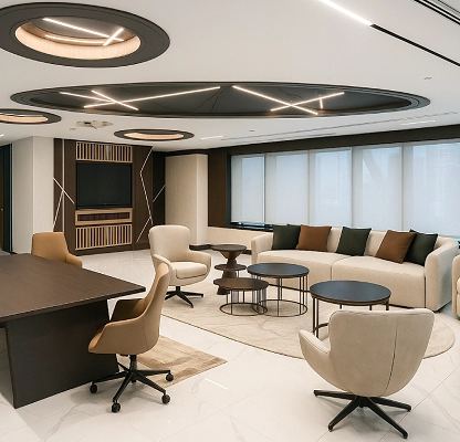
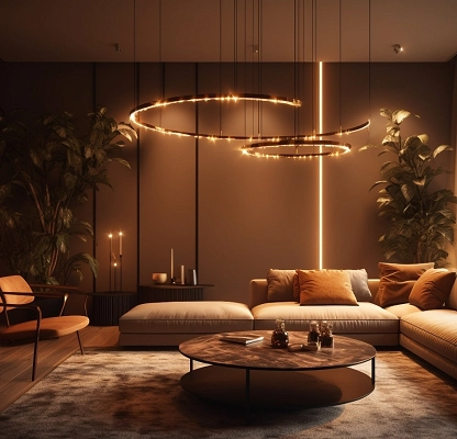
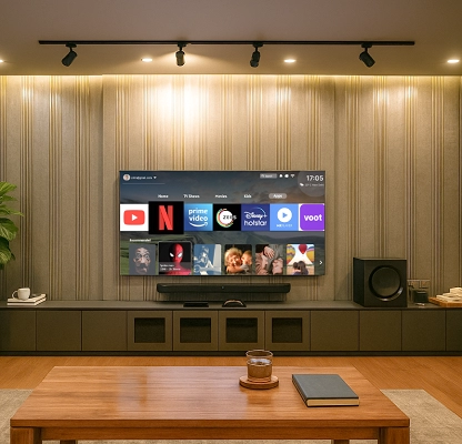
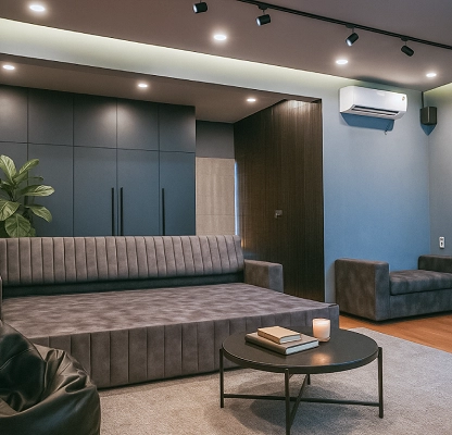
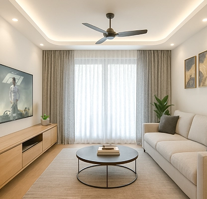
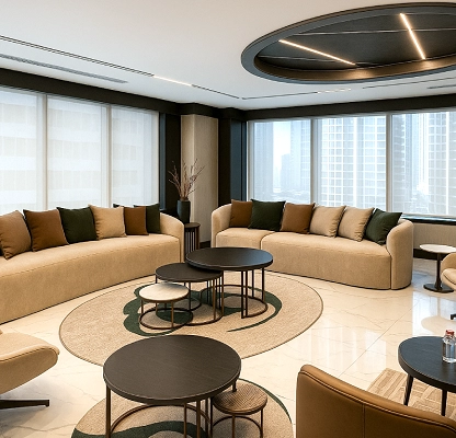
Living Room and Family Room
The living room is the place where you communicate with the guests and spend quality time with family. When choosing the color palette for the living room, make sure it is welcoming and comfortable.
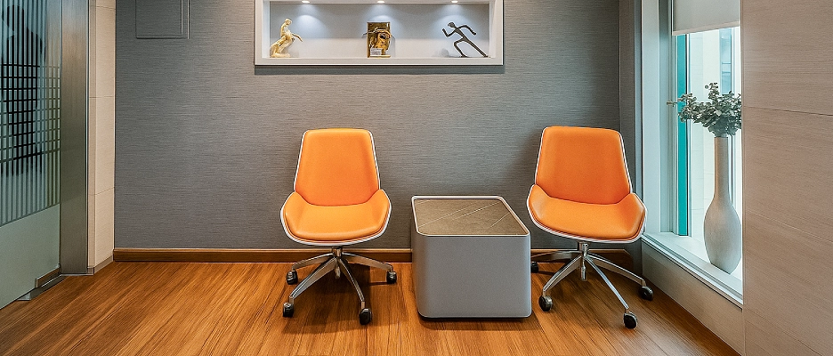
* Warm colors like red, orange, and yellow can create your space cozy and inviting.
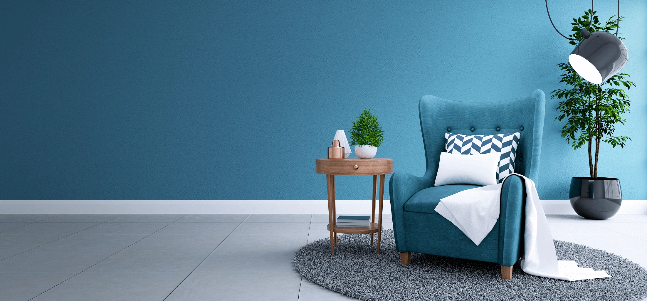
* Cool colors like blue, green, and purple make the spaces where relaxation is focused.
* Neutral colors like beige, gray, and white make a balanced backdrop that works with the furniture.
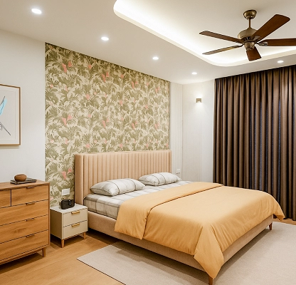
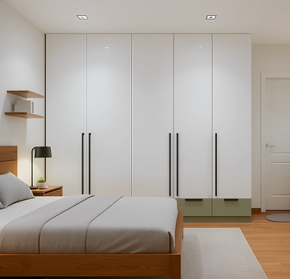
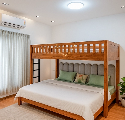
Bedroom
The bedroom is the place for relaxation, so choose colors that invite sleep and calmness. Soft tunes are best in bedrooms, and they create a peaceful environment.
* Soft blues and greens are used for bedrooms
* Soft browns and taupes are some kind of earthy tones that make the bedroom interior design feel cozy and grounded.
* Avoid bright colors like red or yellow, as these can be too energizing in the bedroom interior design.
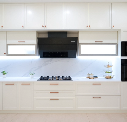
Kitchen
The kitchen is a space for creativity and activity, so the color should inspire energy and promote focus.
* Warm yellows and oranges can encourage appetite and make a great kitchen.
* Light blues and fresh greens can create a clean and refreshing look.
Bathroom
The bathroom is the smaller space in your room, and the colors in the bathroom can influence the size and the terms of relaxation.
* Light and airy colors of white and blue can make the space feel larger.
* Pastel shades create a serene spa-like atmosphere.
The natural lights in the room can enhance the colors in the room. Choose the color palette wisely.
North-Facing Rooms
North-facing rooms have cool and soft lights. It makes the color appear cooler and darker.
South-Facing Rooms
South-facing rooms can handle cooler shades. Rich blues, greens, and grays are used in this area.
East and West-Facing Rooms
East-facing rooms are getting soft light in the morning and cool light in the evening. Neutral tones such as soft grays or beige will balance the lighting of the day.
The foundation of the room design is the base color that we choose.
Neutral Base Colors
White, gray, beige, and taupe are some of the neutral colors that are used as base colors. These colors provide a clean and neutral backdrop for furniture and artwork, making it easier.
White : Clean and reflective color that can open up the space.
Gray : Cool and warm tones to suit various styles.
Beige : Provide a neutral canvas that complements a variety of accent colors.
After selecting the base color for your commercial interiors in Bangalore, the next step is choosing accent colors that contrast it.
Monochromatic Scheme : Choose different shades of the same color. For example, light blue, navy, and dark blue.
Analogous Scheme : Select colors that are next to each other in the color wheel.
Complementary Scheme : Choose opposite colors such as blue and orange or purple and yellow for bold and energetic contrast.
When choosing accents, use varying shades and tones of the same color to create visual interest.
It's important to test the colors before committing to the colors. Sample tests on your walls can understand the look at different times. So, take time to understand the shades that suit your commercial interiors in Bangalore.
Use large swatches : Test larger sections, as small patches can be misleading.
Observe the room at different times of day : Check the color lighting at different times of the day.
Furnishing : Place furniture and rugs that combine with the color scheme.
Colors can be chosen from the textures and materials in the room. In dining room designs, a glossy finish will reflect light and make colors appear brighter. The home interior designers will provide the best collection for commercial interior designs in Bangalore.
Using different textures such as wood, glass, and metal can also create an aesthetic vibe. The Best Interior Decorators in Bangalore provide the best commercial interiors in Bangalore.
Glossy finishes : It makes the space feel more vibrant.
Matte finishes : It creates a cozy feel in a room.
Natural materials : Wooden furniture with organic elements will pair with earthy tones.
Finally, the chosen colors should match your personal styles and interests. Whether you prefer a traditional, minimalist, or modern look, your color palette should match your vibe. Your choice can complement the interior design. Your color schemes deserve your personal opinions.
Choose the perfect color palette for your room by considering factors like the room's function, the natural light, and your personal style. Remember to test colors before choosing them. With all these tips in mind, you'll be well on your way to selecting the ideal color palette for your room.


©2026 Accilaire Interiors. All Rights Reserved